Utils
Contains a useful plotting function that is used in the coding examples. The function was built using Plotly instead of Matplotlib due to its interactive graphs. It works well in an interactive session in VSCode. In terminal mode, the results are displayed in a web browser.
-
utils.plot_line(x, y, xname='Time (s)', yname=None, axes='single', marker=False, legend=None)[source] Plot lines using plotly.
- Parameters
x (list(float)) – x values for plotting.
y (list(float)) – y values for plotting.
xname (str) – The x axis title. Default value is
'Time (s)'.yname (str, list(str)) – The y axis title. A string or list of strings containing the names of the y axis titles. If
None, the y axis titles will be'y0','y1', etc.axes (str) – The configuration of axis on the plot. If
'single', multiple curves are plotted on the same axis. If'multi', each curve is plotted on its own axis.marker (bool) – Displays markers on the curves if
True.legend (list(str)) – List of legend names for multiple curves. Length of legend must be the same as length of y.
>>> import numpy as np
>>> from labjack_unified.utils import plot_line
>>> t = np.linspace(0,2,100)
>>> y0 = np.sin(1*np.pi*t)
>>> y1 = np.cos(1*np.pi*t)
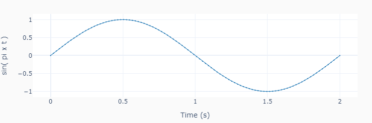
>>> plot_line([t], [y0], yname='sin( pi x t )', marker=True)
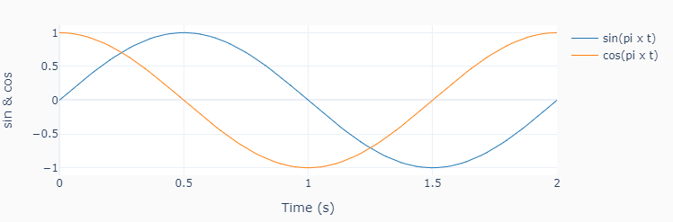
>>> plot_line([t]*2, [y0, y1],
              yname=['sin & cos'],
              legend=['sin(pi x t)', 'cos(pi x t)'])
>>> plot_line([t]*2, [y0, y1],
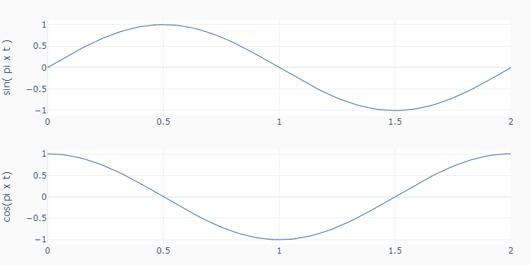
yname=['sin( pi x t )', 'cos(pi x t)'],
axes='multi')